Serial

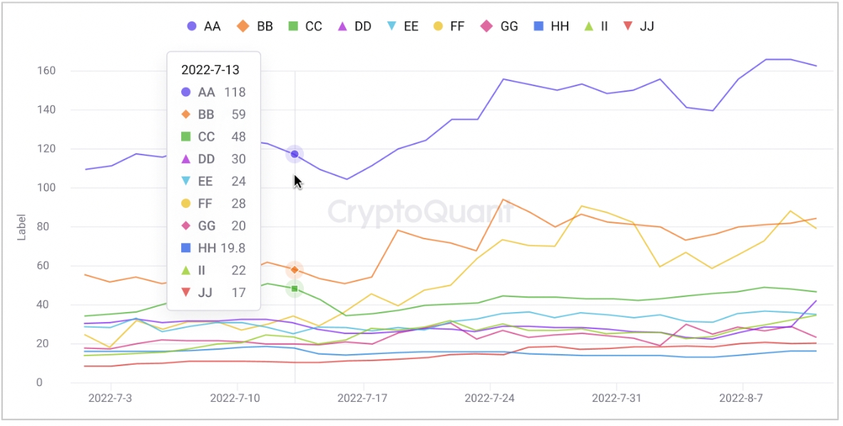
Choose from various display types
Data

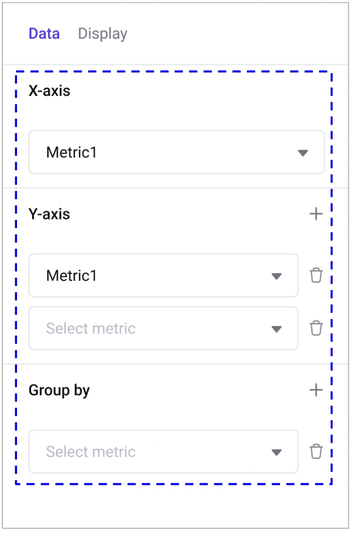
Set the x axis column and columns to show as y axis values. You add more metrics to draw at the same time. You can set group by column if there are categories that you would like to separate values and show each of them as a series.

Display

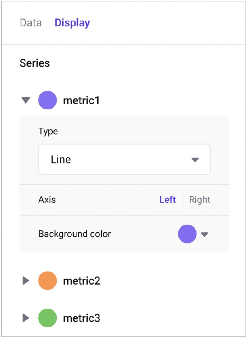
  1. Series: You can specify the color and chart type (bar, line, stacked bar, stacked area). Additionally, you can choose whether to use the left or right y-axis for the series.

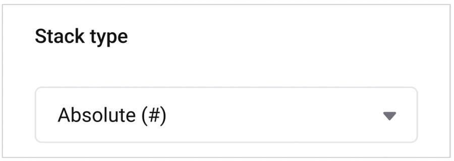
  2. Stack type: If there are stack type series, you can choose whether to display them as absolute values or as a percentage of the total.

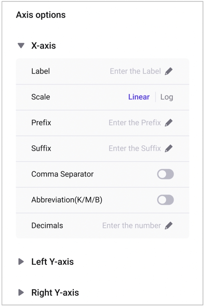
  3. Axis options: You can set the label and formatting for each x/y axis.

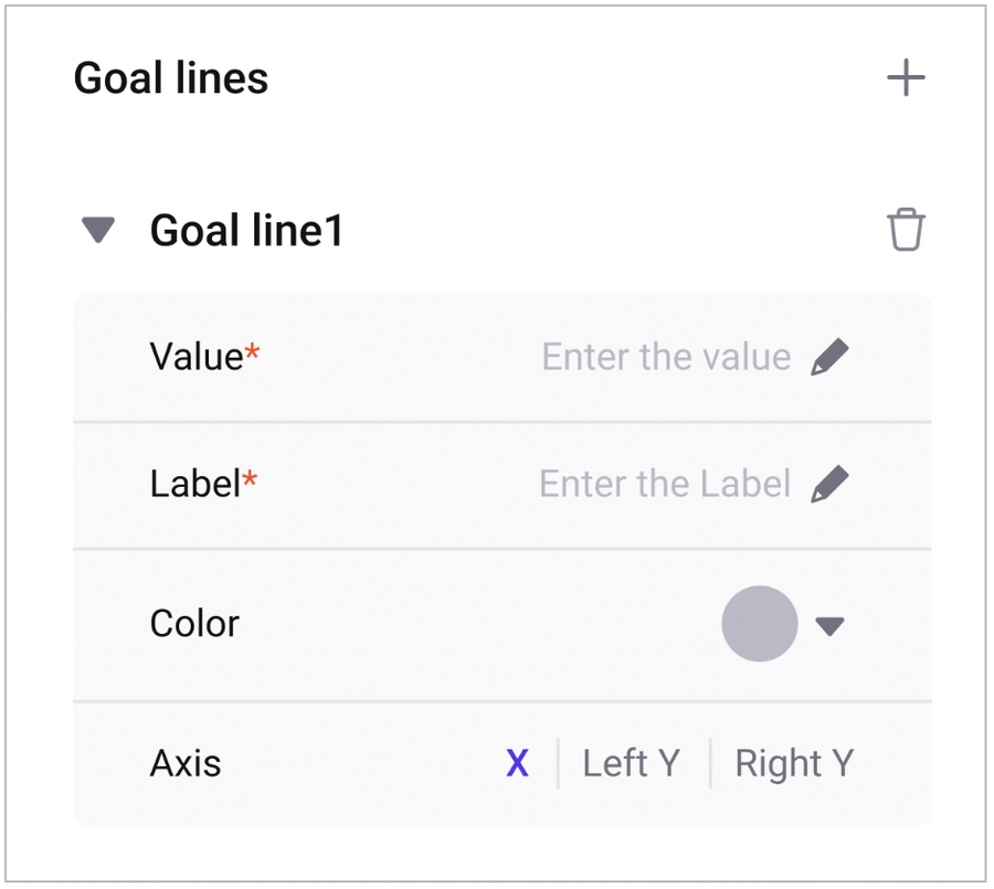
  4. Goal lines: You can add goal lines to charts to display important values as dotted lines.

  5. Color bands: You can also add color bands to fill a range of important values with color.

Last updated